Standard Cannabis Company is an industry leading medical and recreational marijuana brand. SCC is the umbrella brand for multiple cannabis brands and continues to pave a standard for the industry as a whole.
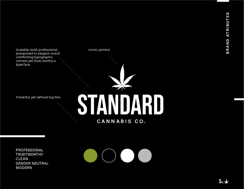
Challenge: The creative brief was just that, brief. The only pillars to build this visual identity was a few core attributes.
1. Professional 2. Trustworthy 3. Clean 4. Gender Neutral
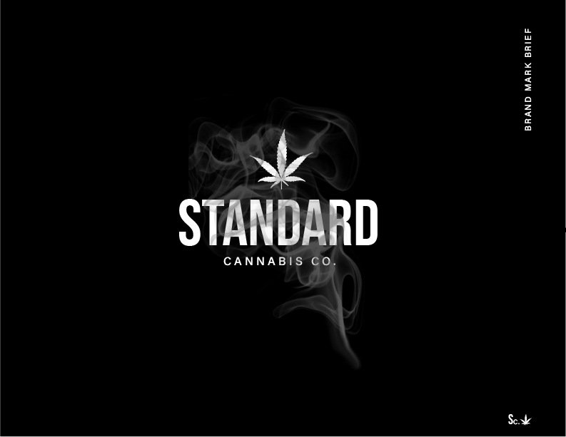
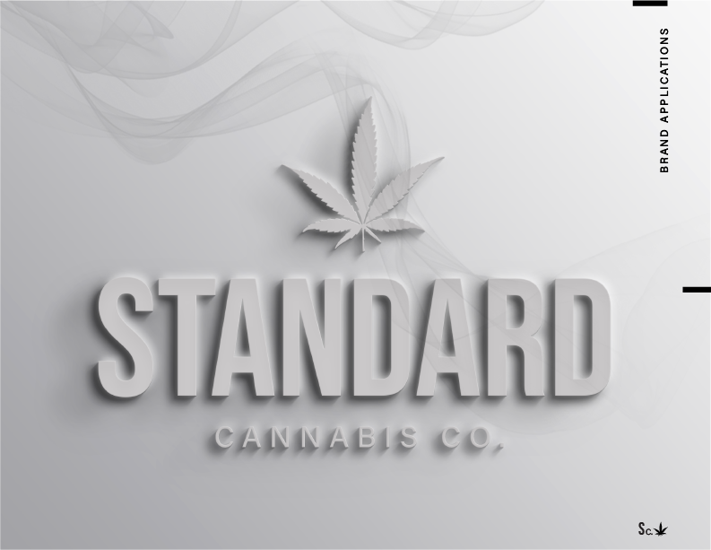
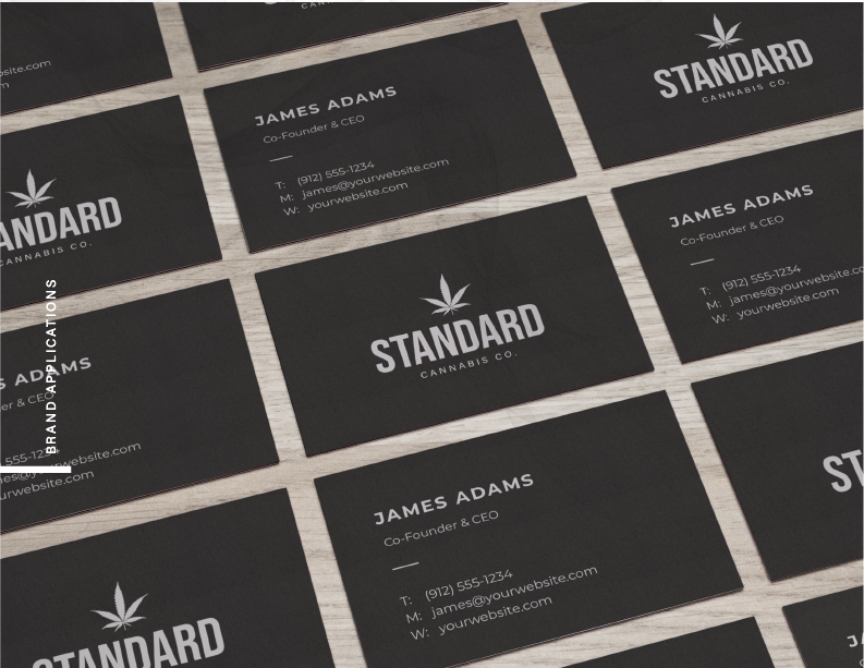
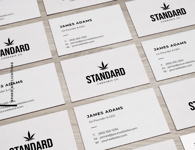
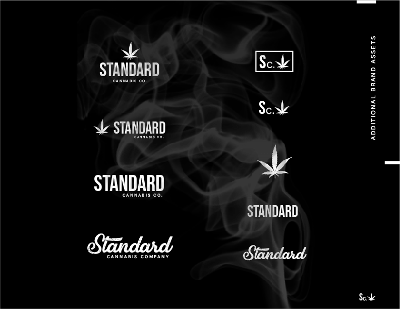
Solution: We solved this through a scalable, bold, professional typeface. Juxtaposed to elegant, round, and comforting typographic corners while maintaining a trust-worthy word mark. This iconic symbol and bold word mark is accompanied by a powerful, yet refined tag line. The black and white color palette gives this brand a sophisticated and professional appearance which is one of the priorities in the challenge. My intention with such a minimal brand mark is to give the client the ability to effortlessly use it in multiple brand applications.
Disclaimer: This project was a design challenge initiated by the Auxiliary Group.
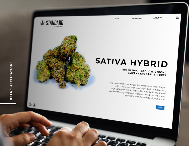
Services: Visual Identity | Stationary | Website | Advertising